 |
Brillia is a sweet modern calligraphy, soft hand-lettered handwritten font. Fall in love with its authentic feel and use it to create gorgeous wedding invitations, beautiful stationary art, eye-catching social media posts, and cute greeting cards.
| |
Brillia is a sweet modern calligraphy, soft hand-lettered handwritten font. Fall in love with its authentic feel and use it to create gorgeous wedding invitations, beautiful stationary art, eye-catching social media posts, and cute greeting cards.
 |
Stana is clean and tall display font. There are more than 150 glyphs included.
 |
| Download Stana Fonts Family From Wirtu |
 |
Andora Ardelion is a stylish and elegant new calligraphy font, suitable for designs that need both a touch of elegance and modernity. This font has a lot of swashes that can help anchor your projects in ornamental glamour.
 |
| Download Andora Ardelion Fonts Family From Gittype |
 |
A very expanded sans serif font in capital letters inspired by the inscription on a bank note
Old bank notes tend to have a very typical typography. Usually they carry decorative and elaborately designed markings. For one thing, they must be practically impossible to forge and for another, they should make a respectable and legitimate impression. And in the days of copper and steel engravings, that meant nothing less than creating ornate, shaded or otherwise complicated scripts. Designing the appropriate script was literally in the hands of the engraver.
That’s why I noticed this bank note from 1948. It is the first 20 mark bill in the then newly created currency ”Deutsche Mark.“ All other bank notes of the 1948 series show daintier forms of typography with an obvious tendency toward modern face. The 1949 series which followed shortly thereafter reveals the more complicated script as well. For whatever reason, only this 20 mark bill displays this extremely expanded sans serif variation of the otherwise Roman form applied. This peculiarity led me in the year 2010 to create a complete font from the single word ”Banknote.“
Back to those days in the 40’s, the initial edition of DM bank notes was carried out by a special US-American printer who was under pressure of completing on time and whose engravers not only engraved but also designed. So that’s why the bank notes resemble dollars and don’t even look like European currency. That also explains some of the uniquely designed characters when looked at in detail. Especially the almost serif type form on the letters C, G, S and Z, but also L and T owe their look to the ”American touch.“
The ingoFont Banknote 1948 comprises all characters of the Latin typeface according to ISO 8859 for all European languages including Turkish and Baltic languages.
In order to maintain the character of the original, the ”creation“ of lower case letters was waived. This factor doesn’t contribute to legibility, but this kind of type is not intended for long texts anyway; rather, it unfolds its entire attraction when used as a display font, for example on posters.
Banknote 1948 is also very suitable for distortion and other alien techniques, without too much harm being done to the characteristic forms.
With Banknote 1948 ingoFonts discloses a font like scripts which were used in advertising of the 1940’s and 50’s and were popular around the world. But even today the use of this kind of font can be expedient, especially considering how Banknote 1948, for its time of origin, impresses with amazingly modern detail.
 |
| Download Banknote 1948 Fonts Family From Ingo |


 |
Harri –“stone” in Basque language– is a display font based on the peculiar letter forms used in signs and fascias all over the Basque Country. This idiosyncratic lettering style, very often used as an identity signifier, evolved from ancient inscriptions carved on gravestones which can still be found in the French part of the Basque Country (Behe Nafarroa, Lapurdi and Zuberoa).Harri takes some of its more significant features from those engraved letter forms, but also from the current overemphasized shapes derived from them, while keeping in sight their antecessors: the Romanesque inscriptions and ultimately the Roman Capitals. Gerard Unger once said “the black version of a font is a caricature of the regular”. This may explain how the odd heavy shapes in use in the Basque Country today might have evolved from their engraved roots, which are already an interpretation of Romanesque and Roman letter forms.
This evolution is echoed in Harri through its weights, from the clean formal Roman-inspired light to the extreme expressive Basque-style extra bold.
 |
Frizzy is a classic look vintage style font with a big set of additional characters. Lowercase letters have 4 stylistic sets with different shapes. Uppercase letter has two additional glyphs with upper and lower swashes. All those features can be found in the OpenType panel. Five extra swashes are available in the glyphs panel. When combining all of this features, you can create an interesting and unique lettering compositions.
Thank you and have a nice day!
 |
Dorris - Swirly font family
Unique, cute and versatile serif family with alternates and ornaments to create a more stunning display. Try capital letters for groovy vintage style look or Capitalize for a happy, cute and beauty.
This Family has 9 weights from thin to black with a soft and curly tail that makes this font look funky and fresh.
Suitable for use in many design forms, for example, magazines, DIY projects, quotes, ice cream, postcards, logos, vintage look badges, old classic music, the 60s, 70s, 80s era, stickers, label, kids, baby, wedding projects and many more. We recommend using Adobe Programs.
 |
The result of reducing elements of letterforms to only its necessity in lowercase is mostly influenced by the ideal of Aerodynamics. The true intention behind the design of Cobe is to construct a fluid typeface while maintaining a strong structure of uppercase that possessed distict forms, shapes and corners, resulting in an eye-pleasing texture when forming a sentence.
Cobe comes in 9 consecutive weights with italics and standard features.
 |
| Download Cobe Fonts Family From Stawix |
 |
For anyone who prefers to stand out from the crowd, than to go with the flow!
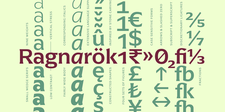
Arpona is a typeface with small wedge serifs and a strong character, ideal for corporate design and all projects characterized by a sense of individualism – for example art, fashion, food, beverage and lifestyle topics.
Arpona is inspired by roman letters carved in stone but otherwise difficult to categorize. It is neither a pure serif nor a sans but rather a symbiosis of different design concepts. Because of its display qualities, Arpona is a good choice for packaging, advertising and editorial design and is well readable even in running text on screen.
The family has nine weights, ranging from Thin to Black plus corresponding italics. Each style includes 590 glyphs supporting all western-, eastern- and central-european languages including four sets of figures and various currency symbols.
For more information visit the microsite: http://floodfonts.com/arpona
 |
| Download Arpona Fonts Family From Floodfonts |


Introducing a conceptual script font: Asia Impact. It's a brush handwritten typeface inspired by asian traditional calligraphy. Each letter has two shapes versions for uppercase and lowercase characters. It works both in horizontal and vertical orientation. Asia Impact is perfect for tattoo design and authentic eastern lettering.