


The extra bold sans serif stencil lettering on movie posters and lobby cards for “Reform School Girl” (a 1957 film by American International Pictures) was the basis of Reform School JNL, which is available in both regular and oblique versions.
The extra bold sans serif stencil lettering on movie posters and lobby cards for “Reform School Girl” (a 1957 film by American International Pictures) was the basis of Reform School JNL, which is available in both regular and oblique versions.
 |
Heath Notted is suitable for display like poster, halloween, witch theme. We created it inpired by the night, because some times night is not always just dark, but sometimes it's beautiful.
Heath Notted is includes:
- full set uppercase and lowercase letter;
- numerals;
- large number of punctuations;
- ligatures, and swash.
Please add this font as your favorit, hit like button, or follow me. I'll very happy for that and aprreciated it.
Thank you!
 |
Fugel is a delicate and incredibly distinct handwritten font with beginning & ending swashes. Fall in love with its incredibly versatile style and use it to create spectacular designs!
Fugel is perfect for branding, logo, invitation, stationery, social media post, product packaging, merchandise,
blog design, game titles, cute style design, Book/Cover Title and more.
What's Included :
- Fugel.otf
- Beginning & Ending Swash
- Multilingual Support
---
Hope you enjoy with our font!
Attype Studio
 |
| Download Fugel Fonts Family From Attype Studio |
 |
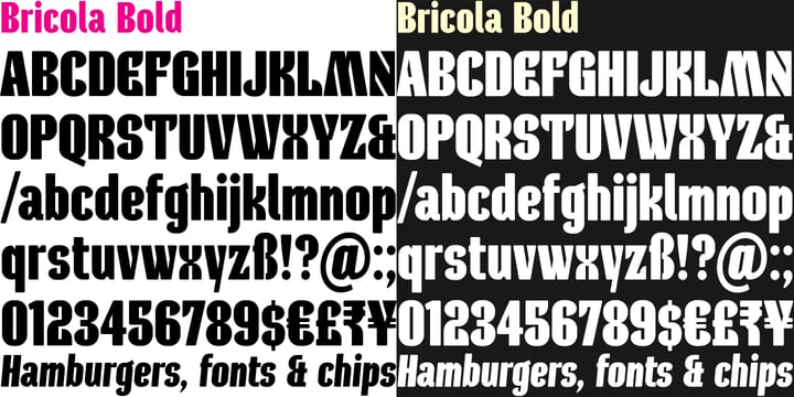
Bricola (rhymes with Nicola) is a condensed display face that contrasts soft curved outlines with sharp cuts and counters.
Sturdy and idiosyncratic, Bricola is an eye-catching blend of functional and funky, appropriate for headlines, labels and branding.
The licensed family includes Regular and Bold weights that both pack a punch, and also two handy italics (obliques).
 |
| Download Bricola Fonts Family From K-Type |
 |
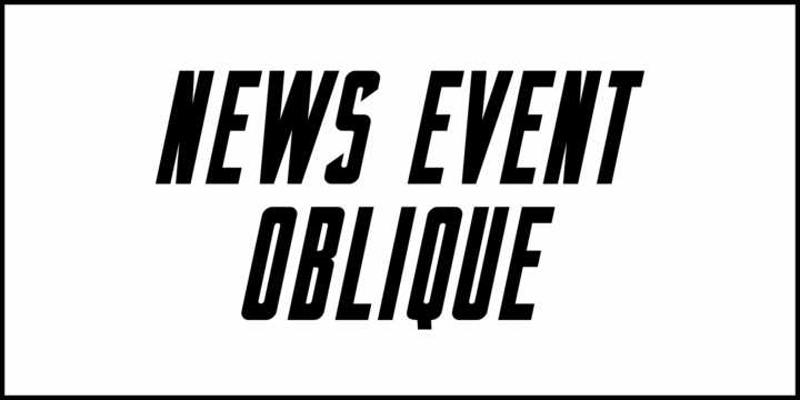
A vintage newspaper front page from June 6, 1944 proclaimed “France Invaded” in a bold, condensed wood type that has been revived as News Event JNL – available in both regular and oblique versions.
 |
| Download News Event JNL Fonts Family From Jeff Levine |


Horrified Tonight - Halloween Font Horrified Tonight - Halloween Font is a display font that is inspired by horror style because its shape is very unique and is perfect for any project that you will use with this theme.
Horrified Tonight came with opentype features such stylistic alternates, stylistic sets & ligatures good for logotype, poster, badge, book cover, tshirt design, packaging and any more.
Features :
1.Uppercase & Lowercase
2.Multilingual support
3.Number
4.Symbol
5.Punctuation
6.Extra Dingbat
7.Support in Mac and Windows OS -Support in design application (photoshop, illustrator, and more)
 |
Mollis Gothic is inspired by the medieval gothic calligraphy. The gothic calligraphy is classical and traditional, I want to add something modern in it. So the letters are simplified as lines and without the handwriting feel, just like a sans font. Meanwhile, the gothic calligraphy visual look remained.
It expands the usage area because of the modern feel of this font, such as the package, titles, logo, poster design etc.
 |
 |


 |
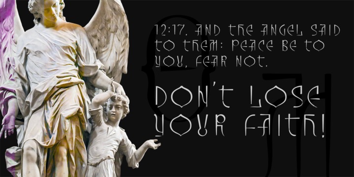
Inspired from archaic slavonic calligraphy, with a modern, fresh and spontaneous look, Architype AD-2014 is a display font designed for impactful and original headlines that has somehow to do with historical or religious content.
 |
| Download Architype AD-2014 Fonts Family From DePlictis Type |
 |
 |
 |
| Download Sportsboard JNL Fonts Family From Jeff Levine |
 |
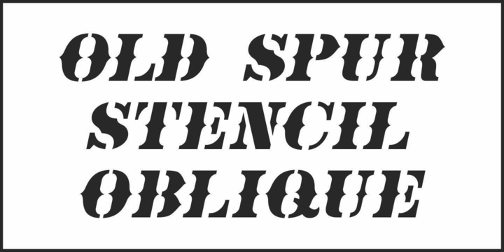 |
| Download Old Spur Stencil JNL Fonts Family From Jeff Levine |
 |
While searching through microfilm of an old, 1932 newspaper, I stumbled on the word "Poultry" written with trapezoidal letters. I did not recall seeing lettering like this and it inspired me to design a typeface that could produce a similar result.
Poultry Sign has six styles in two widths, each with three weights. It is monoline, monospaced, and all caps. The letters on the lower-case keys reverse the trapezoid of those on the upper-case keys. The designer's expectation is that the most common use for this typeface will alternate upper-case and lower-case keys. The spacing of the letters is identical within each width so the styles can be layered to produce bi-colored or tri-colored letters. There is a second set of numbers that can be accessed with an OpenType stylistic alternative. Also accessible with OpenType stylistic alternatives are variations of letters T, N, L, Y, and lower-case V.
 |
| Download Poultry Sign Fonts Family From Ingrimayne Type |


 |
The original design came from Berthold Herold typeface, designed by Hermann Hoffmann during 1913 (Art Nouveau style) in Germany. This project started from flyer printed during 1947 with movable type, the specimen was scanned as a source to development some of the uppercase letterforms. However the most unusual and tricky element from this sample is the leg from the uppercase (R) which is different from the original Herold design, until now I didn’t found where this version originally came from. This font family only contain the bold weight, but there are also a stencil and expanded versions available.
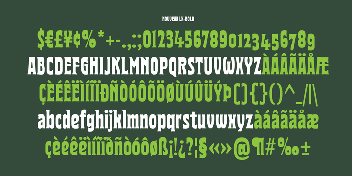 |
| Download Nouveau LX Fonts Family From Vanarchiv |
 |
The original design came from Berthold Herold typeface, designed by Hermann Hoffmann during 1913 (Art Nouveau style) in Germany. This project started from flyer printed during 1947 with movable type, the specimen was scanned as a source to development some of the uppercase letterforms. However the most unusual and tricky element from this sample is the leg from the uppercase (R) which is different from the original Herold design, until now I didn’t found where this version originally came from. This expanded version only contain the bold weight, however there are also stencil (Nouveau LX Stencil) and condensed version (Nouveau LX) available.


The original design came from Berthold Herold typeface, designed by Hermann Hoffmann during 1913 (Art Nouveau style) in Germany. This project started from flyer printed during 1947 with movable type, the specimen was scanned as a source to development some of the uppercase letterforms. However the most unusual and tricky element from this sample is the leg from the uppercase (R) which is different from the original Herold design, until now I didn’t found where this version originally came from. This stencil typeface only contain the bold weight, but there are also available other versions without stencil cuts, like Nouveau LX and Nouveau LX Expanded.
 |
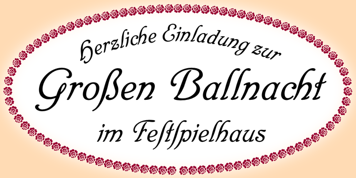
RMU Trianon is a revival of Heinrich Wieynck’s great design which was released by Bauer in 1905.
This beautiful Art Nouveau font comes with a long s and a historical form of the letter H.
Border and adorning elements were added which you can reach by typing [alt] + P and [alt] + p.
 |
| Download RMU Trianon Fonts Family From RMU |